Release Notes v3.4.2
![]()
Overview
Version 3.4.2 gives iPassport a bit of a facelift, introducing styling changes in order to make the application even more intuitive. We’ve expanded the use of the left sidebar, which previously only offered fast access to ‘My Tasks’ but is now used much more heavily.
The feature we’re really excited to be launching with 3.4.2 is Simple View. This offers a stripped back, less complex iPassport interface. The aim here is to make the system as intuitive as possible for infrequent iPassport users.
We have a minor improvement to the competency area, adding configurable categories for your tests and assessments.
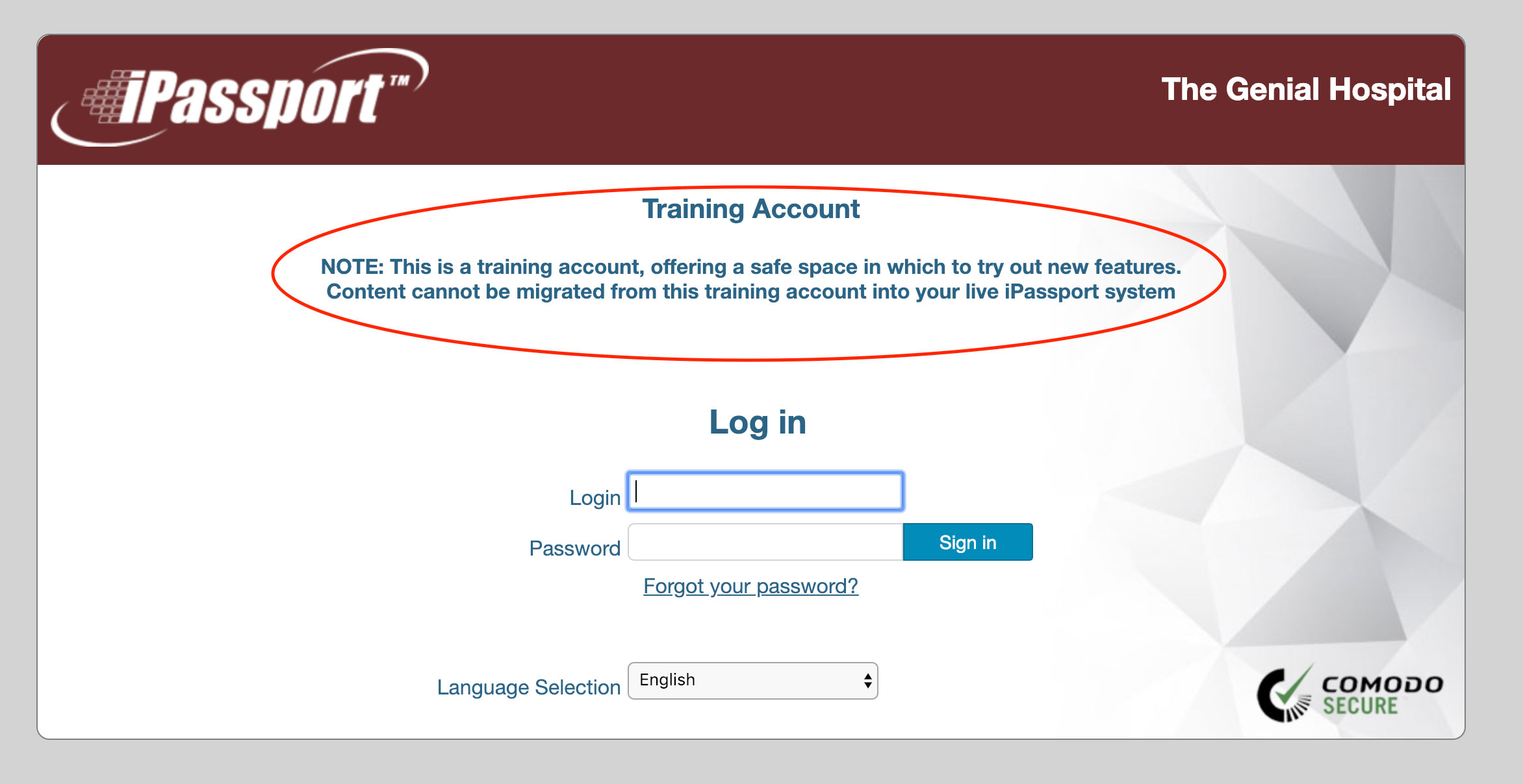
Finally, ever since we redesigned iPassport’s (v3.0.0) interface the live and training accounts have had a very similar look and feel. 3.4.2 makes your training account easily distinguishable, with a very noticeable red header applied rather than the standard blue on your live account.
Simple View
We hope Simple View will make iPassport completely intuitive for users who only need to to complete tasks or search for content. We’ve created a simplified interface with a friendly home page and much of the navigation stripped away.
By default users can easily flip between simple and detailed views using the link in the bottom of the left sidebar menu:
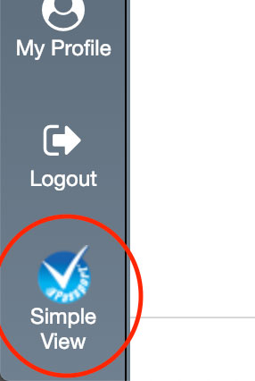
Administrators are able to restrict individual users to simple view or disable simple view altogether if it is not wanted.
Please do let us know what you think of this feature. Have we locked down too much? Is there anything we could add which would make this work better?
For full details please see the ** Simple View User Guide link here **.
Layout Changes
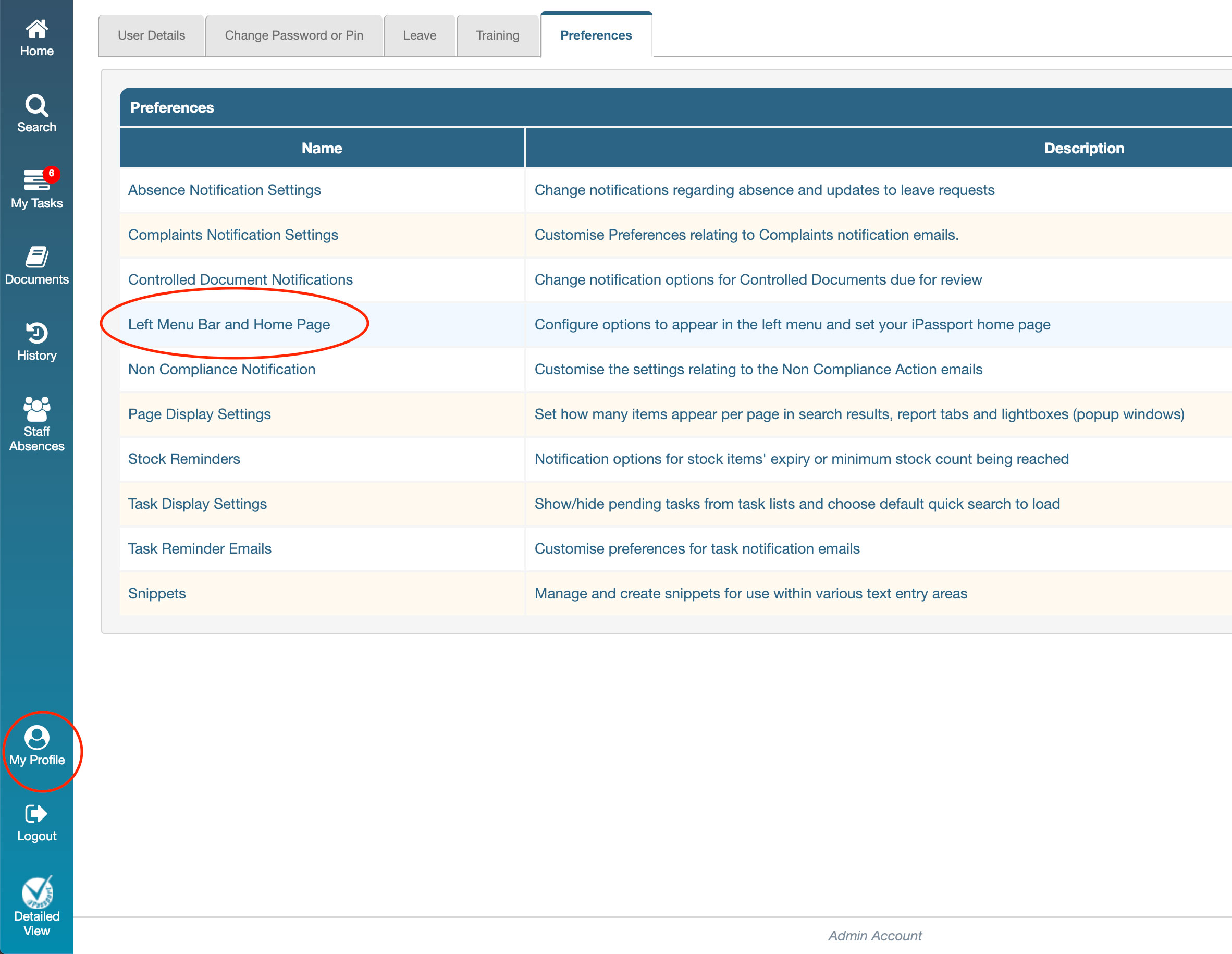
In our efforts to continually enhance the usability of iPassport we have made some styling changes. We’re now focusing much more on the left sidebar, which previously offered only a pull out list of your tasks. Gone is the old right menu, de-cluttering the screen and opening up space to make iPassport easier to use on a mobile device.
Sidebar Menu
The left sidebar will become the key way of navigating iPassport for most users (and is in fact the only way of navigating when in simple view). In future releases we’ll be enhancing this area, adding the ability to further customise which options are visible. Right now it is possible to show/hide Staff Absences, link to Documents and My History via your profile preferences:
Re-positioning of Elements
The following elements have a new home in iPassport v3.4.2:
| Element | Old Position | New Position |
|---|---|---|
| Search | Upper Right of the screen | Left Sidebar |
| Logout | Header Menu | Left Sidebar |
| User Guides | Right Menu | Accessed via Help link in top right menu |
| Contact Support | Right Menu | Accessed via Help link in top right menu |
| About iPassport | Right Menu | Accessed via Help link in top right menu |
| History | Right Menu | Left Sidebar |
| Staff Absences (optional depending on preferences) | Right Menu | Left Sidebar |
| Inspection Prep | Header Menu | Quality Management / Inspection Prep |
We have tried to centralise support into a single ‘Help’ screen, easily accessible from the upper right corner of iPassport in detailed view or from the home page in simple view. This Help screen contains the following tabs:
- User Guides - Our repository of user guides, updated with each release.
- Who Can Help Me? - admins and super users at your facility/department who should be the first point of contact for how-to and permission questions
- Contact iPassport Support - raise a support request with the iPassport team
- About iPassport - Version history for iPassport
- Privacy Policy - Genial Compliance Systems’ privacy policy
- (Legacy User Guides) - They are outdated but we’ve made our old guides available here in case they are useful. We are in the process of moving these over to our live User Guides repository
We moved the global search box from the upper right of the screen to the sidebar. The advantage in doing this is that users can perform a search in the sidebar then navigate around the system and when they return to the search box their results will generally be retained. This makes working through a list of documents, for example, much easier. It also provides a consistent experience for users whether they are in simple or detailed view.
Friendlier Controlled Documents Area
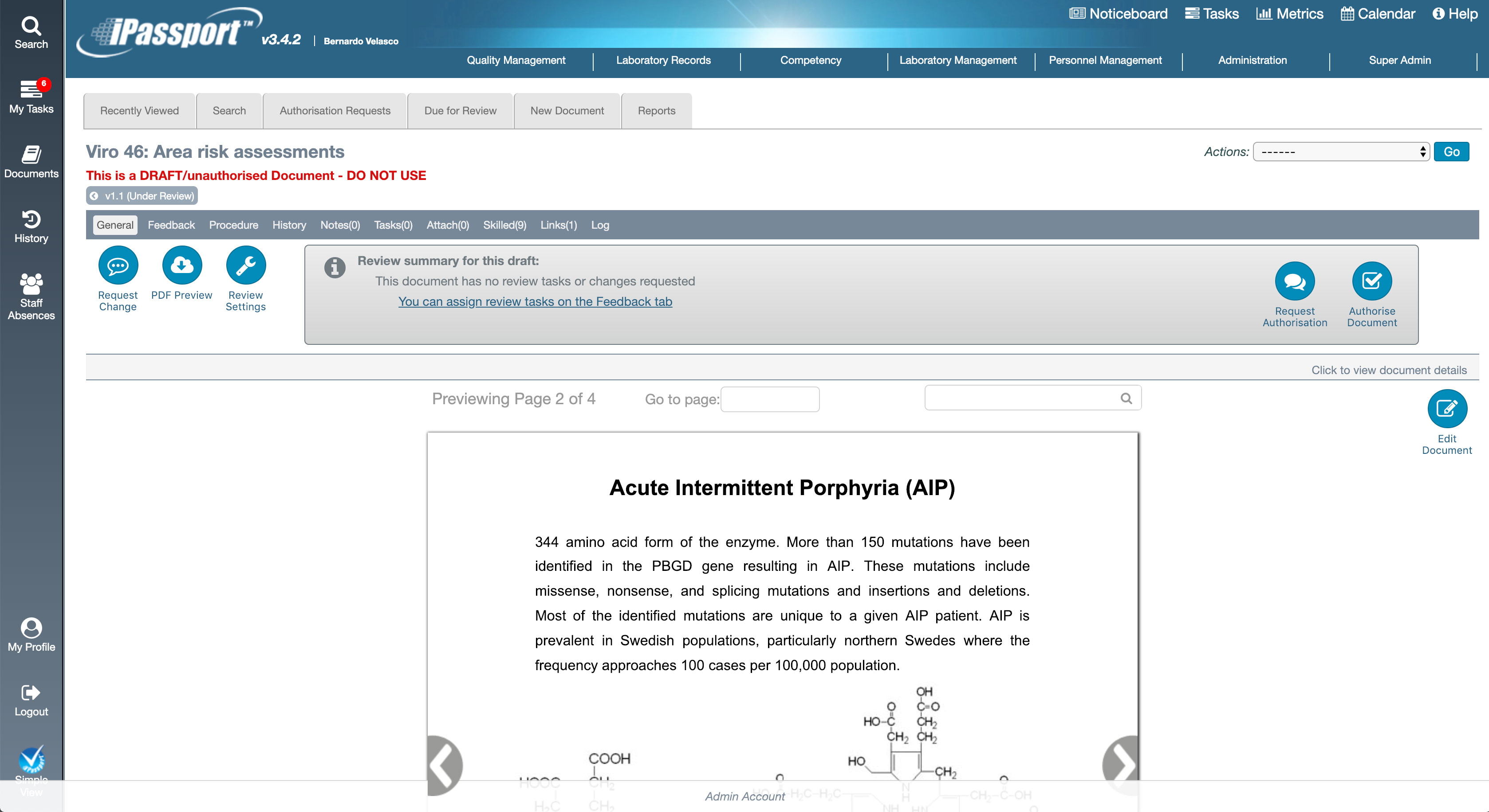
We’ve made some small changes to Controlled Documents, adding nice, rounded buttons and making it easier to complete the most common tasks directly from buttons on the screen rather than from the Actions drop down.
This styling will be flowing out through the other areas of iPassport in coming releases.
Training Account Highlighting
To help distinguish between your Live and Training accounts we have changed the colours from blue to red and also added a notice to the login page on training accounts:
Competency Test and Assessment Categories
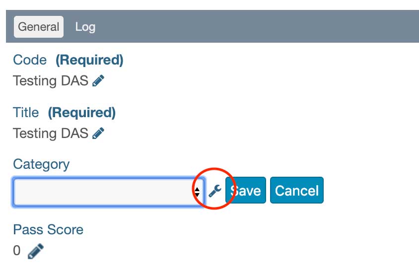
It is now possible to use account-defined categories with your competency tests and assessments. To get started open a draft test/assessment in the designer, edit the category field and click the spanner/wrench icon to start defining your categories.
New User Guides
Updated User Guides
- Document Change Requests
- Document Reviews
- Effective Date Functionality
- Inspection Prep
- My Tasks
- Personal Preference Management
- Skill Management
- System Settings
- User Management
Validation Documentation
- Click here for Simple View
- Click here for an updated version of, Competency Tests - Creating questions